Feb 21, 2024
Timeline: 8 months (on hiatus)
Project Overview
Paypas is a cutting-edge payment solution designed to make transactions stress-free with just two clicks. As the sole designer, I have been responsible for the entire project, from branding and website creation to app design.
Problem Statement
In today's fast-paced world, users demand quick and seamless payment solutions. Traditional payment methods often involve multiple steps, leading to user frustration. Paypas aims to revolutionize the payment process by offering a streamlined, two-click payment system that is both efficient and user-friendly.
Introduction- lets get down to business
The project is divided into three phases:
Phase 1: Branding
I was tasked with creating a comprehensive style guide, selecting colours, typography, patterns, mockups and stationery. Additionally, I also crafted the business persona, including the brand mission, vision, and voice.
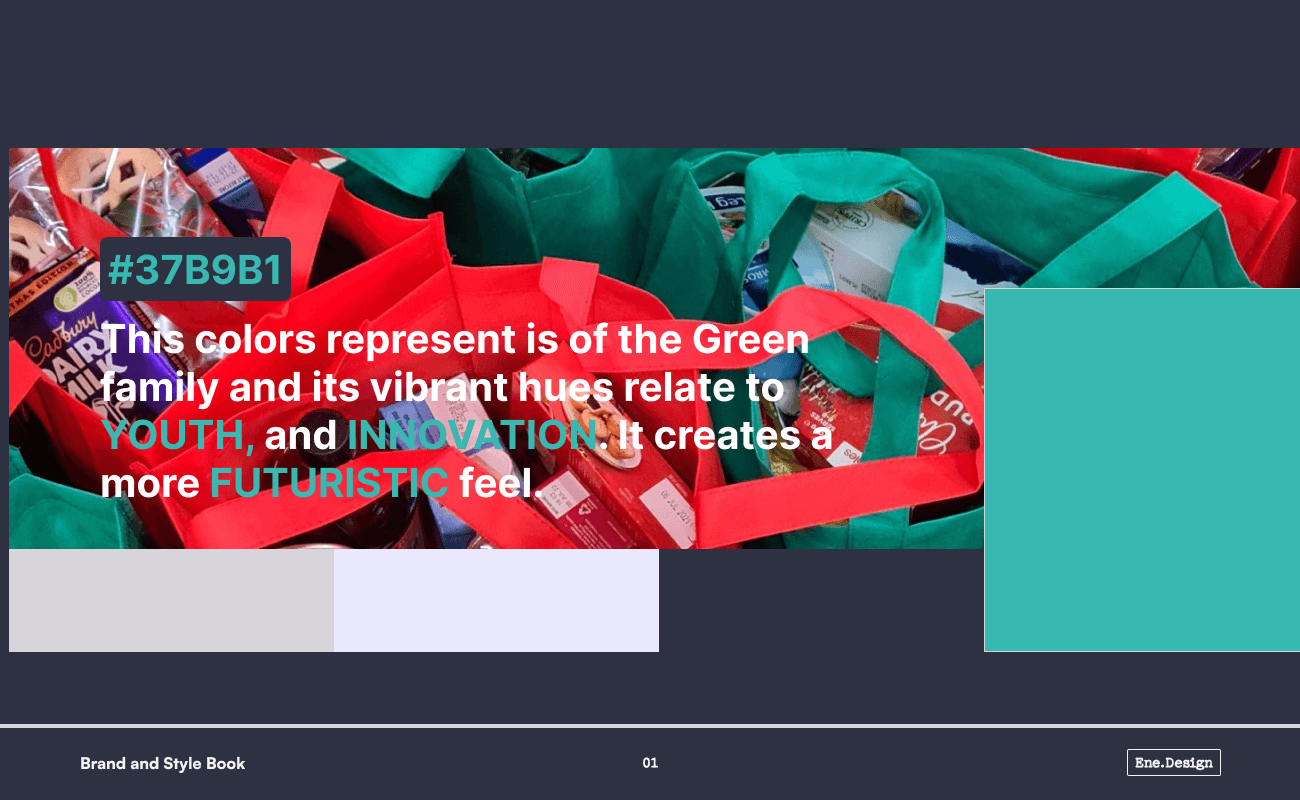
Extract from the brand document speaking on colours

Extract from the brand document showing logo in its proper form
I ensured i worked hand in hand with the other members of the team to understand our shared goals and vision of the product.

Extract from the brand document showing logo misuse
As the solo designer, ensuring uniformity across all platforms was crucial. This style guide needed to be versatile enough for both digital and print mediums and be captivating enough to remain memorable.
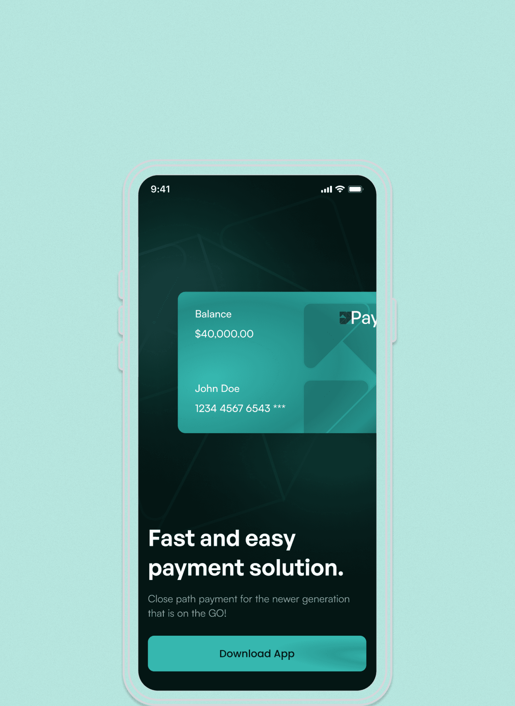
Extract from the brand document showing proposed app mockup, showing the use of Paypas branding
Phase 2: Website Design
Up next, I developed a responsive and modern one-page website to inform users, developers, and investors about Paypas and its offerings. I tried to make the website as modern and innovative as possible. It needed to be YOUTHFUL and Informative. I ensured users were informed and captivated by implementing these solutions;
gif- Responsive Flow of the Landing Page in action
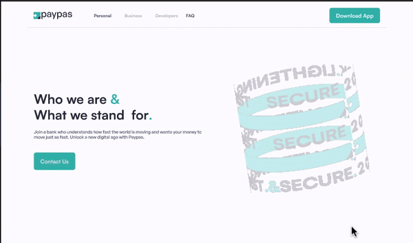
Hero Section
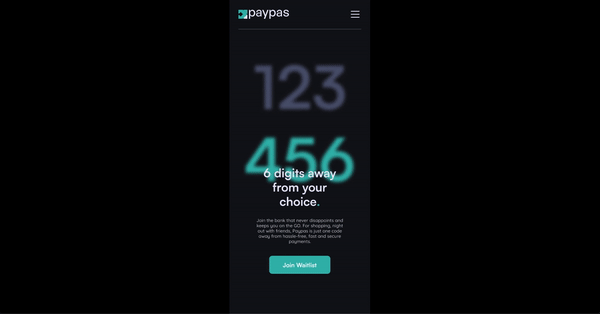
This vital element of the landing page needed to stand out and communicate Paypas’s unique selling proposition (USP) clearly. I incorporated a 6-digit code as a visual asset to capture users' attention. It is right and center bold enough to quip the curiosity of new users to wanting to know more

img- Side-by-Side Comparison of Dark and Light Mode for the Hero Section of the Landing Page
3D Modeling
Utilising Spline, a web-based 3D modelling and animation tool, I created an engaging 3D rendering of Paypas's offerings. This visual asset, prominently featured in the "About Us" section, showcases our commitment to innovation and enhances user engagement.
gif- Spline 3D Object Implementation in the Design
Here is how i did it;
I started by designing a visually appealing banner in Figma, ensuring it aligned with the overall branding guidelines.
I opened Spline and created a cylinder object with my preferred dimension.
I applied the prepared banner as a texture fill on the cylinder, giving it a dynamic look.
Set states and timing, i configured different states and timing within Spline to animate the 3D object, making it interactive and visually captivating.
After previewing and several adjustments, i rendered the final 3D design in Spline.
I then exported the animated 3D object as a mp4 which i later converted to gif for integration into Figma, where it could be used effectively in prototypes and the live website.
By combining Figma's design capabilities with Spline's 3D modelling tools, I created a unique visual element that highlights Paypas's innovative spirit and enhances the user experience.
Phase 3: App Development
The final phase involved creating a Minimum Viable Product (MVP) for the Paypas app, one that would be aimed at investor and stakeholder testing.
I began by analysing the fintech ecosystem in Nigeria, focusing on prominent players like Pocket, Kuda, and Carbon, which cater to our target user group. Conducting in-depth competitor analysis was crucial. I spoke with friends and family who use these apps to gather insights into their frustrations and expectations. This feedback informed how I integrated user-centric improvements into the design process of Paypas.
Home Page & Payment Page
The home page had to facilitate easy payments in line with our product promise. Balancing the copy code for sending money and the paste field for receiving money was challenging. I experimented with dynamic and separate card designs.

img- Wireframes showing the two versions of the home page being combined with the payment page
After research and testing, I decided to maintain a separate payment page to accommodate niche functions such as airtime purchases, traditional bank transfers, and, most importantly, funding the Paypas wallet.
This approach aligns with industry practices set by other fintech apps, adhering to Jakob's Law. By incorporating familiar design patterns, we ensure that our users have a seamless and intuitive experience, consistent with what they expect from similar applications.
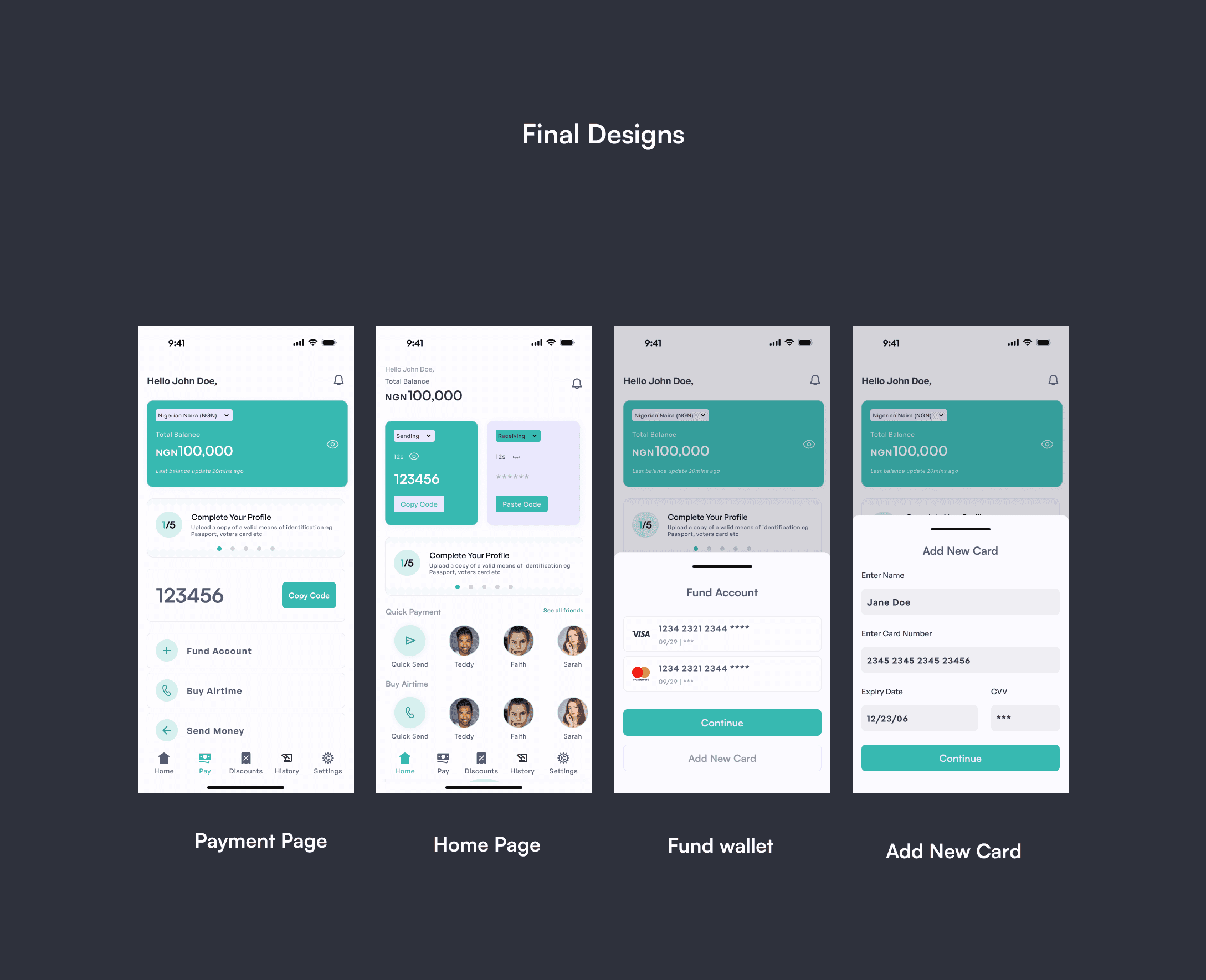
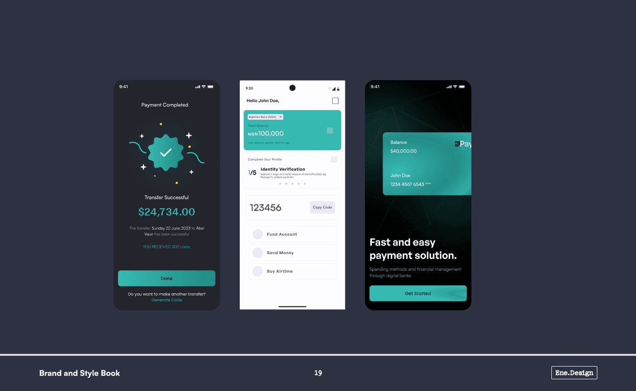
img- Hi-Fi mockups showing the final versions of the home page, payment page, add fund and add new card screens
A unique twist in this design is that the home page resembles a traditional fintech payment page, while our payment page looks like a typical home page. This is because Paypas is designed to be a payment-first platform. To achieve our USP of enabling payments in just two clicks, this unconventional approach was necessary.
Other Page Wireframes

img- A section of IOS and Andriod wireframes showing modals, pop-ups and other misc pages
Conclusion
Paypas is an ongoing project. Started with the aim to showcases my ability to handle complex tasks from end to end. Feel free to explore the Figma files here and reach out if you’re interested in collaborating!.

img-image of the section of the website
Thank you for reading.
Project Roulette… View another project